As a solopreneur, you have to know how to do it all. On any given day, you could be a course instructor, graphic designer, copywriter, social media personality, accounting expert, YouTuber….
And on top of all that, you also need to know how to build a website for your business.
And that website needs to bring in customers and revenue.
Your website is a virtual home base for your solo business. It’s your little slice of the internet where you can find your target audience, connect with customers, share your knowledge, and earn money for your work. It’s a space that you get to design and control — no weird ads or algorithms to steal your audience’s attention.
Today, all-in-one tools like Podia make it easy to set up a great-looking site. With one tool, you can manage your domain name and web hosting, publish blog posts, and take care of the behind-the-scenes tasks that go into running your own website.
But the key to building a professional website that actually drives revenue for your business?
Well, that’s a tough nut to crack if you’ve never done it before.
You have to think about what pages your website should have, what to include on each page, web design techniques to make your site feel like you, and how to keep your website visitors moving toward your paid products.
We have seen thousands of solopreneurs and creators just like you build profitable websites and here’s the secret: there’s a formula you can use to make every page of your website bring in sales and new audience members from day one.
In this article, we’ll cover:
-
The two key elements solopreneurs need to have when building a website
-
Why you should choose a platform that ‘does it all’ for your small business
-
A step-by-step guide on how to build a website that drives sales and audience growth for your solo business, including the exact structure we’ve seen thousands of entrepreneurs use
You’ll learn how to make a website that takes new visitors on a journey from strangers to subscribers to paying customers so you can do what you need to do: make money online.
The biggest reason your website isn’t growing your business
A lot of website guides focus on the style and design of your website, without paying attention to how the site functions for your business. You need your site to look good, of course, but you also deserve to have a site that brings in sales and subscribers who love what you do.
That’s why there are two key elements your website needs to have to successfully grow your business.
Function: Your website needs to take new visitors on a journey where they get to know you and trust you, and ultimately purchase your paid products.
Every journey will look different, but this is the format we see work well for many Podia users:
-
Someone doesn’t know you at all, but they’re looking for answers that you can help them with. In their research, they find your business through social media, your blog, or Google.
-
They enjoy your free content, blog posts, videos, and social media posts, so they check out your website. On your site, they see your free lead magnet that could help them even more.
-
They sign up for your free resource by providing their email address, and you have an automated email campaign set up that sends welcome emails and helpful tips over several days. Now they’re seeing your name in their inbox regularly and they love all the resources you’ve shared.
-
After a few days of providing value, you tell them about a paid product. They buy it and love it, so you upsell them on another paid product.
-
The cycle continues as more people find your business and enter the system, and you create new products based on real audience feedback.
The main goal of your website is to take visitors from stranger -> subscriber -> customer.
After you’ve mapped out what this looks like with your specific product lineup, you can move on to Part 2.
Feel: Your website needs to feel like you. It should match your brand and personality, and you should love the way it looks.
(This is easy to do with Podia since all the website sections look great out of the box, and you can customize everything in just a few clicks… but more on that later!)
These pieces work together to give your customers a better experience with your brand, and keep people moving toward the products, courses, and offers that earn you money.
Part 1: Structuring your website layout and pages to drive sales for your business
As you set up your site, remember that you’re actually building a system that sends people toward the next stage with your business.
-
Discovering your business for the first time
-
Enjoying your free content and resources
-
Getting on your email list
-
Buying a paid product
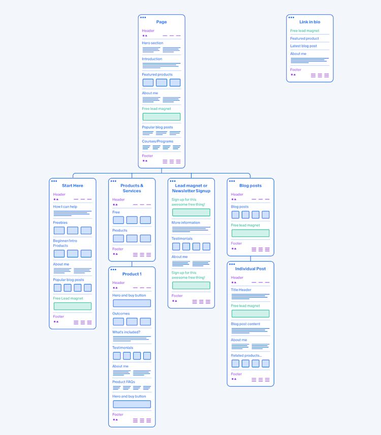
With your customer journey in mind, here’s a simple layout for your website based on the thousands of solopreneurs we’ve seen build profitable businesses.
-
Home page
-
“Start here” page
-
Newsletter or lead magnet sign-up page
-
Products and services page (which links out to individual product sales pages)
-
Blog page (which links out to individual blog posts)
-
Link in bio page (not linked on your home page, only shared on social)
In your top bar navigation, your home page will be linked under your logo. Then include links to your “Start here” page, your newsletter or lead magnet sign-up page, your products and services page, and your blog.
In your website footer, you can add a sentence about what your business does, an email sign-up form, and your Terms/Privacy pages. (In Podia, these technical pages are handled for you automatically.)
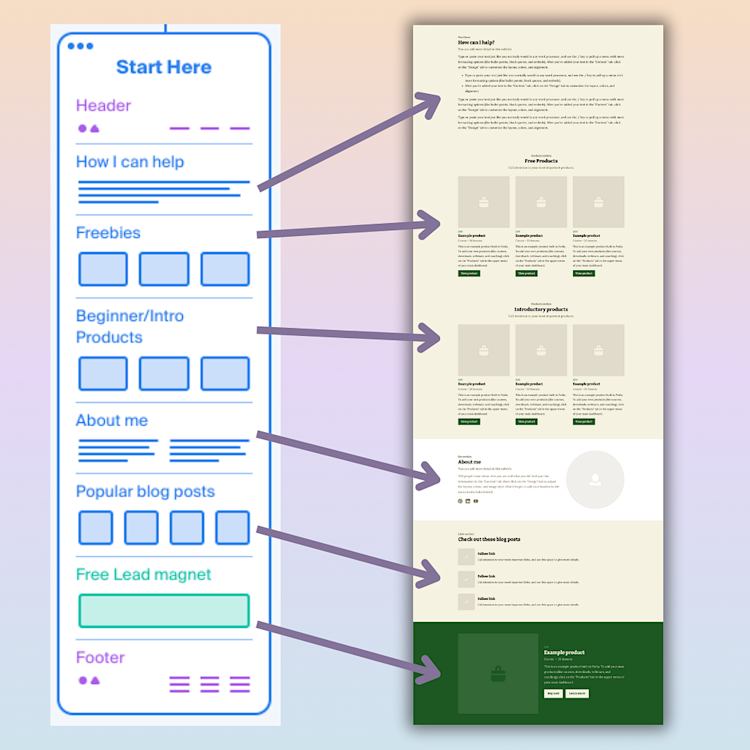
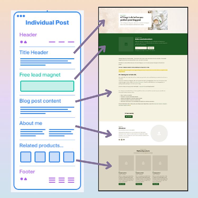
This is what your website looks like all mapped out:
Now, what goes on each page to keep visitors moving forward with your business?
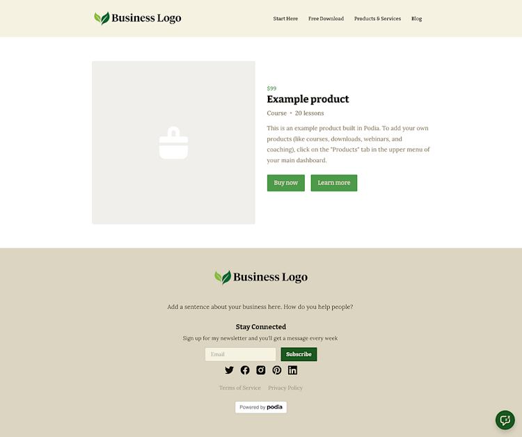
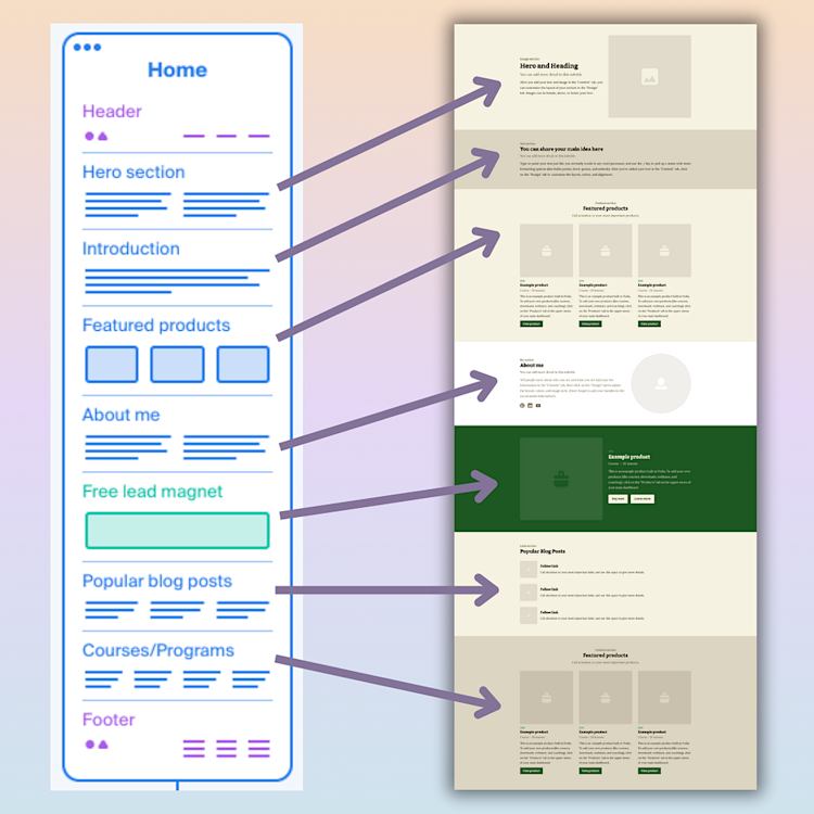
Building your website home page
Your home page is often the first page people will see on your website, so let’s start by telling them how you can help them, what you do, and who you are.
The mockups below have a wireframe outline of what each page should have, as well as an example of what this could look like using Podia’s professionally designed website section templates.
-
Hero section: Start the page with a hero section that explains how you help people. What pain points can you solve? What can someone expect to learn from you?
-
Call-to-Action: In your hero or directly under it, add a button with a link to something you’d like your visitor to do, like sign up for a consultation, grab a lead magnet, or read a helpful blog post.
-
Introduction: Explain the pain points that your customer likely has and how you can help. This shows visitors that you understand where they’re coming from and can provide valuable solutions.
-
Featured grid: Each grid item can point to a product or resource for your ideal customer. You can also use this grid to point to product types, like “Coaching”, “Courses”, and “Downloads”.
-
About section: Add a short “About me” section with your photo, social links, and a few sentences about your journey. (Pro tip: You can make this once in Podia and save it as a reusable website section. That way you can add it to other places on your website in just a click.)
-
Free lead magnet: This is a free resource that you give away in exchange for a visitor’s email address. For many Podia creators, this is the number one way to take people from casual website visitors to email list subscribers, and once they’re on your list, you can get to know them through email campaigns and newsletters. You can learn how to make a lead magnet here and get ideas for your lead magnet here.
-
Popular blog posts: Link to 3–4 of your best blog posts. What questions do beginners in your niche often have? Answer those questions in blog posts and add them here to demonstrate your expertise and give quick wins.
-
Featured products: Link to 3–4 of your most popular courses or programs. If you’re a coach, this could be your primary 1:1 coaching offer. If you sell courses, this can be your flagship program. Alternatively, you could add a “View all products” CTA to this space.
Here are some real creator home pages to give you ideas:
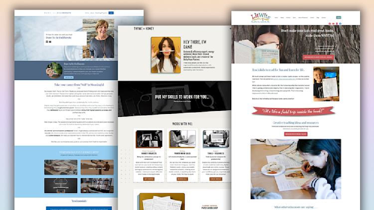
Career coach Angee Linsey from Dare to be Deliberate leads with a hero section and a CTA to join her free community, followed by a text section about how she can help you have a more meaningful career and a grid of four popular programs.
Productivity expert Dani Bruflodt uses the top section of her home page to say exactly who she serves: “I’m here to help ambitious entrepreneurs and small business owners build systems, strategies, and solutions for staying organized, focused, and productive.” She follows up with a description of how she can help entrepreneurs and a grid of three services for different target audience members.
Jenny and Becky from LitWits open their site with the heading: “Don’t make your kids read great books. Make them want to!” They have a CTA to check out their +40 teaching resources, followed by a longer description of what their literature business does and a grid of testimonials.
All three of these businesses lead with information about how they can help their target audience, and they have some kind of free offer, free product, lead magnet, or newsletter opt-in form prominently displayed on their home page.
This helps move visitors to the next stage of the customer journey — engaging with free content and getting on the email list.
But if someone’s not ready to sign up just yet, a handy “Start here” page might do the trick.
Setting up a helpful “Start here” page
Next, we’ll set up your “Start here” page. Think of this page as a letter to someone who has found your business for the first time. Everything on this page should be geared toward new people, and you can spell out the journey you want to take with them.
-
Introduction: Like your home page, it’s important to let prospects know how you can help them achieve their goals. Keep this section about them — what will their life look like after working with you, what will they learn, how will their skills improve?
-
Grid of freebies and beginner-friendly products: This page is for new people, so start by promoting a lower-stakes free product or lead magnet. You can also share lower-cost paid products that lead customers to your big-ticket offers. For example, if your main offer is a 6-month coaching program, you could have a free 15-minute discovery call and a paid 90-minute coaching intensive that people can try first to make sure you’re a good match.
-
About: Add the reusable bio block you built for your home page with your image, short description, and social links.
-
Popular blog posts: Share popular blog posts or free content with visitors. What would someone new to your business want to learn about?
-
Lead magnet CTA: Remind visitors to sign up for your lead magnet or newsletter at the bottom of the page.
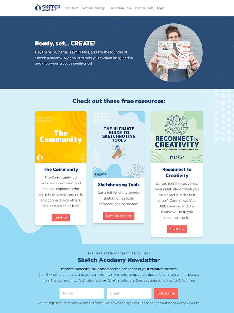
Sketch artist Emily Mills does a great job speaking to new prospects on her website’s “Start Here” page. In her introduction section, she explains that her goal is to “help you awaken imagination and grow your creative confidence.” Then she shares three free products that new sketchnoting artists would like:
-
A free community
-
A list of tools for sketchnoting
-
A free course about how to connect with your creativity
She follows these freebies with a call to action to join her newsletter and receive a free copy of the ultimate guide to sketchnoting tools.
This page gives visitors four clear ways to learn from Emily and get on her email list, and all the resources can help them grow their sketchnoting skills as beginners.
But what if a visitor still isn’t ready to move forward with your business?
That’s okay, we’ve got plenty more opportunities to get them on the list, starting with a lead magnet/newsletter landing page.
Growing your list with a lead magnet landing page
You’ve shared your lead magnet or newsletter form on your home page and “Start here” page, but you can also make a standalone opt-in page to make it stand out. Link this page in your header and share it anywhere new audience members typically find you.
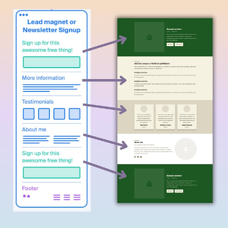
-
Header hero: Include your lead magnet or newsletter title, image, description, and sign-up button.
-
Text section with more info: Let people know how often you’ll email them, what free resources they’re getting, and why they should be excited to join your list.
-
Testimonials: If you have any testimonials for your lead magnet or newsletter, share them here.
-
About section: You can use the reusable bio section you set up earlier.
-
Lead magnet sign-up: Add another CTA box with your lead magnet or newsletter opt-in form at the bottom of the page so people who scroll to the end don’t have to search for it again.
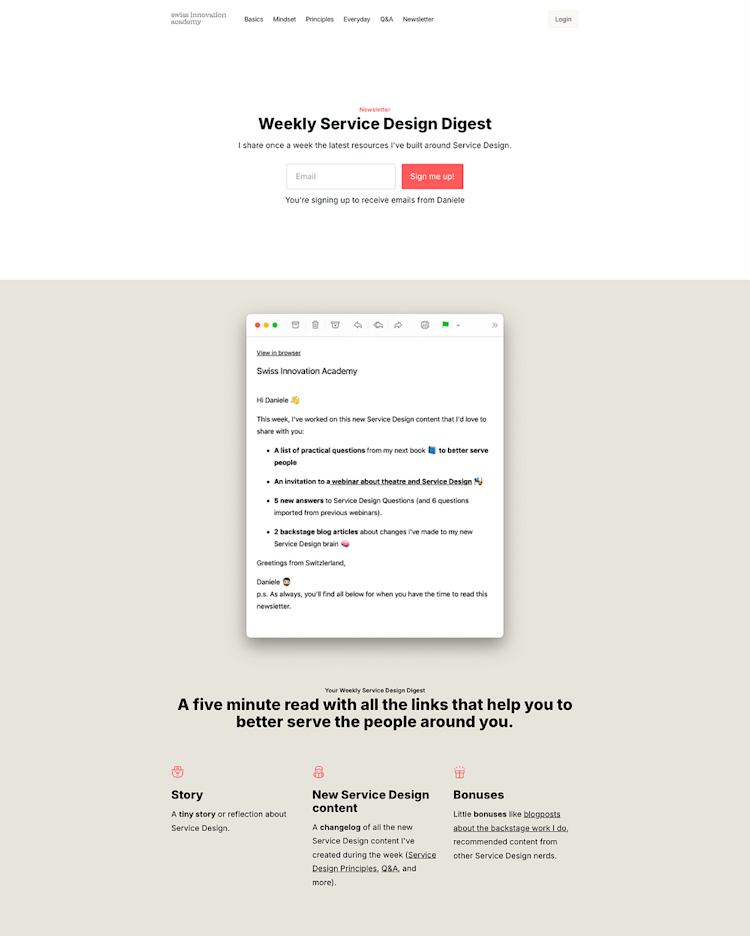
Take a look at this newsletter sign-up page by Swiss Innovation Academy. The top of the page has a big bold signup banner with plenty of white space so it’s easy to see what to do.
Then there’s an example of an email newsletter so visitors know what to expect, and a grid of three extras that people get when they sign up. There’s another CTA and links to previous newsletters below so people can find even more details.
As you build, think of this page as a sales page for your free product or newsletter. You’re “selling” the benefit of your free resource and email list to entice people to join and move forward on their customer journey.
Optimizing your blog posts to drive sales
Blog posts are a great way to get discovered by new audience members, so let’s make sure your articles and blog archive page are set up to capture interested visitors.
First, link your blog post archive page in the header of your website, and include a list or grid of your blog posts as well as your lead magnet sign-up form.
Next, here’s a template for individual blog posts that makes readers aware of your freebies, newsletter, and products.
-
Blog post title, description, and feature image: Kick off your blog post with your title, description, and feature image. In Podia, you can add these details in the blog post builder and the formatting will be the same across all articles on your site. (Read more about how to build your blog in Podia in this help doc.)
-
Newsletter or lead magnet CTA: Put a sign-up form between your title and blog post copy so readers can’t miss it.
-
Blog post copy: Share your knowledge, address pain points, and help readers work toward their goals.
-
About section: At the bottom of your blog post, you can add an “About” section to tell readers who you are. To keep things simple, you can add the same reusable “About me” block you set up earlier.
-
Related products and services: Finally, add a few introductory products and services to the bottom of your blog post template. These should be products that beginners and new visitors would like since your blog post might be their first point of contact with your business.
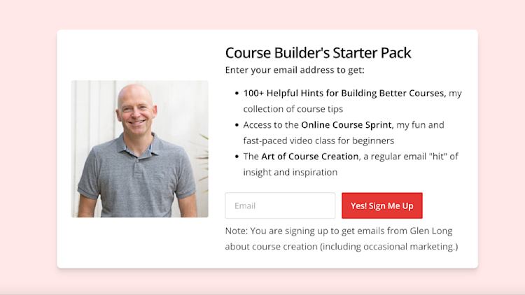
Glen Long, for instance, has his Course Builder Starter Pack lead magnet at the bottom of every blog post. All his content centers around building great online courses, and the starter pack includes 100+ course tips, a video course, and the weekly newsletter so it’s enticing for someone who just read a blog post about course creation.
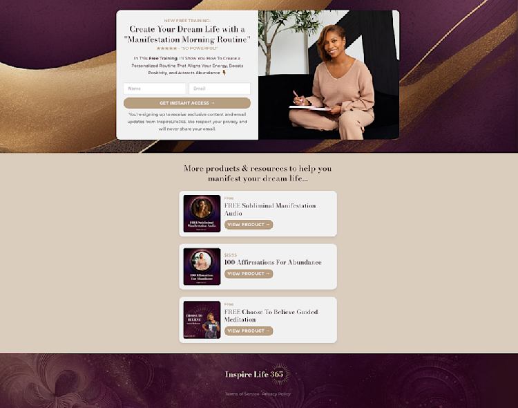
And Natalie Wynn from InspireLife365 ends each blog post with an “About me” section followed by a lead magnet CTA and three related products — a free manifestation guide, a free meditation product, and a paid affirmations product.
This way, readers who enjoyed the post have plenty of opportunities to move forward with Natalie’s business. They can get access to her free training, free products, or paid products and continue their journey.
Up until this point, you've mainly focused on optimizing your website for new clients. You've provided value for free with blog posts and other resources, and shared lead magnets so audience members join your email list.
Now, we’ll look at how to make the most of your paid product landing pages so you can turn those followers into customers.
Crafting effective sales pages for your products and services
Great products need great sales pages. Done right, these pages can move people into the next stage of their customer journey while earning you a reliable income.
If you have several products or services, it’s nice to have an “All Products” landing page organized by category or type.
You can set this up with free products at the top and paid products below if it makes sense to do so, or organize by “course”, “coaching”, “webinars”, etc.
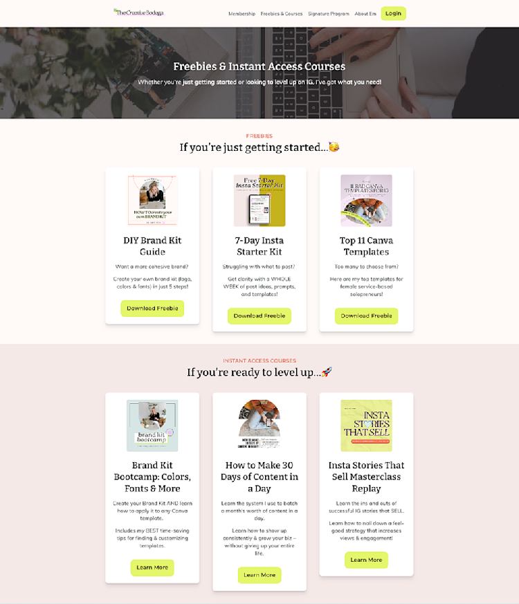
Emily Connors from the Creative Bodega does this on her products page by breaking up products and courses by who they’re best for. At the top, she lists free resources for people who are “just getting started” followed by paid resources for people who are “ready to level up”.
Then, each product, service, or offer should have its own sales page, which you can use the following template to build.
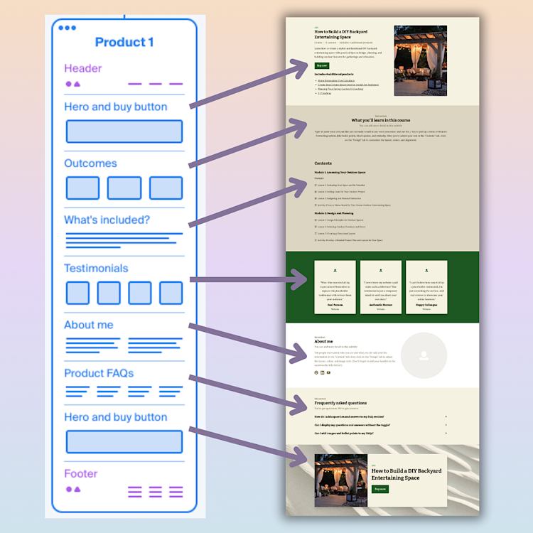
-
Hero Header: At the top of the page, include your product’s title, image, and description. You should also have a prominent “Buy” button.
-
Text or grid section: What is the problem people are facing when they find this product? What pain points can you address for them? Talk about the outcome they’ll achieve, and show how much better life could be with your product.
-
What’s included: If it makes sense for your product, include a course syllabus or table of contents for what customers will get.
-
Testimonials: Ask previous customers to share their experiences with your product. Add them in here for social proof.
-
About section: Drop that reusable “About me” section here.
-
FAQs: Answer any questions that people might have about your product, including your refund policy.
-
Sign-up button: Close the page with another buy button that takes people to checkout.
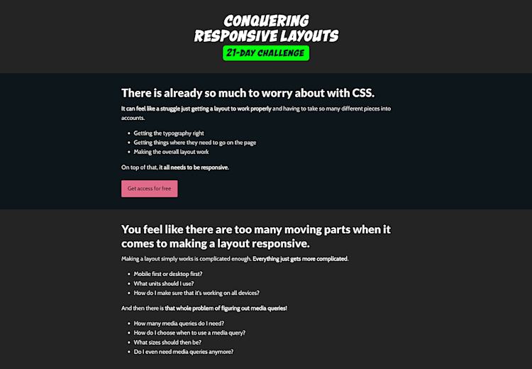
Web development expert Kevin Powell has a great example of a sales page for his “Conquering Responsive Layouts” course. He explains the challenges customers face and why they will benefit from the program. There’s also a bold sign-up button right at the top of the page.
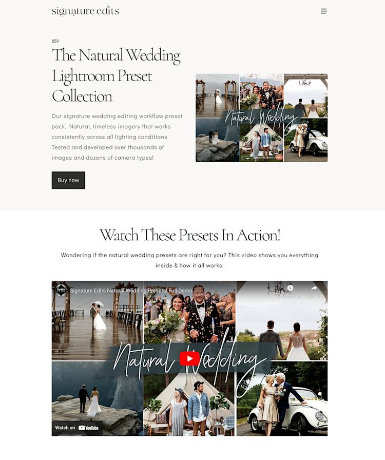
Pro tip: If your products are easier to explain with video, you can embed one right on the page like Ryan from Signature Edits.
What should go on your link in bio page?
You’ve almost got all your core website pages, but there’s one more to think about if you have an audience on social media: Your link in bio page.
Your link in bio is a standalone page that you can link to from social media platforms like Instagram and TikTok. It will almost always be viewed on mobile devices, and everything should fit on one mobile screen with the most important information first.
Here’s a quick template for your link in bio page:
-
Free lead magnet/newsletter sign-up form
-
Link to an introductory product or featured product
-
Link to your latest blog post or other piece of valuable content
-
About me section
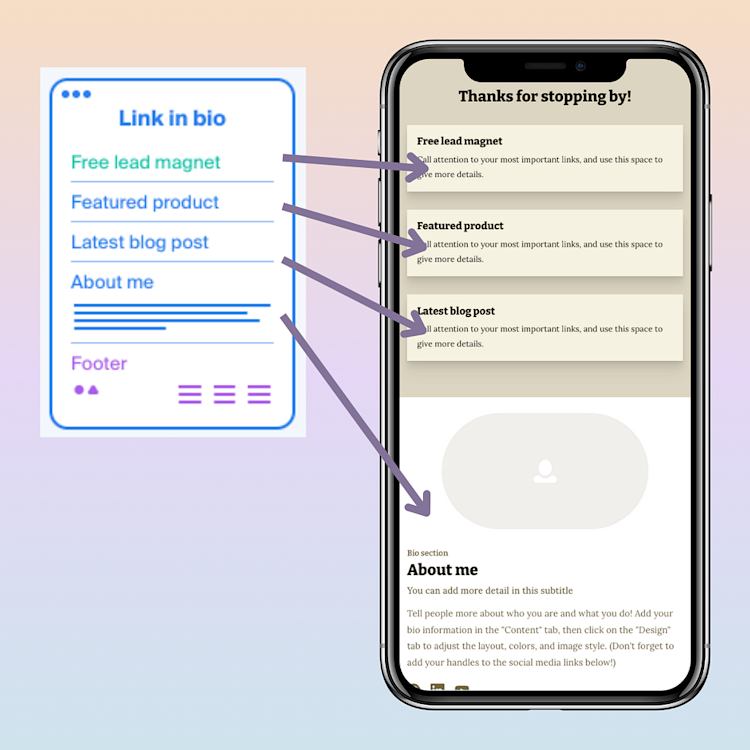
Also, if you’re actively launching or promoting something it should go at the very top!
Add this link to your bio section on socials to take your audience members from everyday social followers to happy customers.
SEO considerations for your website
The last piece of website function is search performance. You’ve built a simple website that points new people to your email list and products. From there, you can continue to grow your connection with them and share more products in the future.
And this system will work even better if you get more eyes on your pages.
Search engine optimization, or SEO, is a way to tell search engines like Google what your website pages are about. Then the algorithm can show your work to people who are looking for you.
In Podia, you already have SEO tools included in every page and blog post so you can give your site the best chance at ranking and bringing in organic traffic.
-
Go into the settings gear for each page and customize your URL, title, and description. These fields should clearly say what the page is about. Here’s how to do that in Podia.
-
Throughout your website pages and blog posts, use H1, H2, and H3 headings to give hierarchy to your content. Each page should have one H1 heading for the title, H2 headings for the main subheadings, and H3 headings for smaller sections within each subheading. Read more about SEO formatting in Podia in this help doc.
-
Interlink articles and pages. Linking your pages together shows search engines how your pages are related to each other. You can do this with Podia’s advanced link feature, which allows you to choose a page you want to link to from a drop-down menu. Here’s how this works!
-
Add SEO blog content to attract more visitors. The more eyes you get on your site, the more potential customers you reach. Check out this guide to using SEO to create optimized blog posts that drive sales.
Following these SEO best practices can help more people find your website, which means more people entering the system you’ve built to grow your audience and income.
Part 2: Making your website look and feel like you
Now you’ve got a website that’s structured with growth in mind.
-
You have plenty of resources for new people to learn about who you are, what you do, and how you can help them.
-
Those resources point people to free products, introductory offers, and email sign-up opportunities.
-
From there, you can tell them all about your paid products and programs and continue growing together long into the future.
Once your site is set up to send you customers on autopilot, it’s time to make it look and feel like you.
All of Podia’s website sections look great out of the box, so at this point, your site is already looking good. But you also have tons of customizations you can use to design your site in minutes.
Here are some quick tips on how to design your website so it matches your brand:
Set your website colors: Podia comes with a universal color palette feature so that you can easily update your site colors across all pages. These can be customized on a section-by-section basis too.
For more info on color palettes, check out this video where Michelle Dale walks you through how to use Podia’s global site settings to make a color palette that works across your whole site.
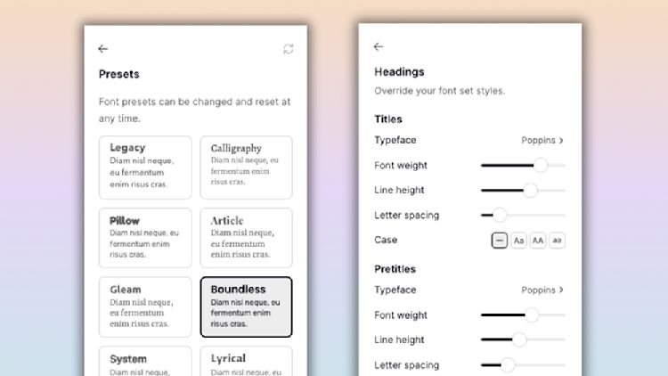
Easy-to-read fonts: Just like with colors, Podia has universal fonts ready to go so your site looks cohesive. Pick one of the premade font combos or make your own, and click to apply your fonts across your website.
Use blank space and give your content breathing room: A lot of people scan or skim websites searching for keywords and information. Giving your words breathing room makes them easier to read.
If you’ve got a lot of written content on your website, it’s helpful to break up large chunks of text with white space and images. You can also use bold and italic fonts, as well as different layouts, bullets, and numbering, to draw attention to specific sections.
Use background images and textures: Adding image backgrounds to your website sections can give your page an elevated look. To do this in Podia, click on the “Design” tab, and you’ll see a space to upload or search for an image background.
Once you add an image, you’ll also see image editing tools. If you’re using text over the image, make sure to adjust the opacity so it’s easy to read.
In this video, Marie Drouvin shows you how to add animations, fade backgrounds, textures, and other website tricks to give your site extra sparkle.
One of the best parts about using a beginner-friendly website builder like Podia is that you can change your mind, update your colors, rearrange your sections, and change your mind back again as much as you want and your site will still look great.
Each section has pre-made templates that work right out of the box so you can’t go wrong. So get in there and experiment!
Your site is set up so new visitors can easily flow to your email list, online store, and paid products, and after you’ve made any design customizations you like, you’re ready to launch.
How to make a website you love — that also builds your business
As you set up your website for your online business, remember the two essential elements:
-
Functionality: Does every page of your website help visitors move from strangers to subscribers to customers? Is it easy for visitors to find your free content and flow into your lead magnets, email newsletter, and paid products?
-
Feel: Does your website design look the way you want it to, is it easy to read and explore for your audience?
As a solo business owner, your website is a part of a bigger system. It sends people to the next step in their journey with you, so you grow today and long into the future.
Now you have an easy website template that you can follow, complete with recommendations for each website page, SEO tips, and design considerations so you make a site you love.
All that’s left to do now is build, so grab your free trial of Podia today to get started. We can’t wait to see what you make.


