Most people think that selling memberships online will be the key to unlocking the kind of lifestyle that they want and that’s very understandable. A membership business is a very attractive business model.
At Podia we’ve seen many people build online communities as another revenue stream. Because the revenue is recurring, once you’ve sold the membership, it’s money in the bank every month, right?
Wrong!
Selling memberships online is a really hard business to build and none of the guides that you find by searching how to build a membership will tell you that.
But with over 150,000 people building online businesses on Podia, we see a lot of data about what works and what doesn’t.
In this article, we’ll look at:
-
The challenges of building a membership program online
-
How there are other much easier ways to get to the outcome that you want
-
A practical step-by-step guide to building a business that gets you money while you sleep (without building a membership!)
By the end of this article, you’ll have all the tools and frameworks you need to build a truly great business with all the perks of regular monthly income but without all the pain of trying to sell online memberships.
Sound attractive? Read on!
All that glitters is not gold: the challenges of building a membership site
A business that makes money while you sleep sounds like an entrepreneur’s dream. And if you can get it, that’s true.
When creators and business owners start thinking about how to get it, though, they often think about adding a membership site to their offering.
You’re here on this page, which means that maybe you’ve felt the same: You already create content on social media. People seem to like you. So it should be easy to get people to pay them every month to receive bonus content, tutorials, access to special live events, and more.
Perhaps you’ve even said those fateful words to yourself:
“I’ve got 10,000 followers on Instagram. If only 1% of those sign up to my membership, I’ll be rolling in dough.”
But there are two major challenges that almost everyone who tries to build an online membership comes across very quickly:
-
Most people who launch memberships find that their focus shifts from doing what they love – creating content – to working out why more people aren’t buying from them
-
Even when it’s going well, you spend so much time trying to keep your existing members that you don’t have time to do what got you those members in the first place. That means fewer new members.
Selling memberships online is actually a really hard business model.
The first hurdle is where most people fall down: you have to create a value proposition that’s compelling enough for a stranger on the internet to go from liking your free content to paying you every month.
If you’re like most people, you’re probably thinking of adding the following to a membership tier:
-
Exclusive tutorials and content
-
Access to invite-only webinars or other events
-
Behind-the-scenes content from your business
-
A 1:1 session coaching when someone joins your top tier
-
Member-only podcast
Woof! That sounds exhausting to me.
That actually leads us to the second problem: Let’s say you can convince enough people to do that so that you’re happy with the income you’re getting, now you have to spend the majority of your time creating the exclusive content that’s behind your paywall so that people can get the value you promised them.
Not only do you have to create all that stuff once, but you have to keep going month after month without ever taking a break.
Let me ask you this: when was the last time you enjoyed running on a treadmill?
A treadmill is exactly what a membership is like – retention becomes a major challenge to figure out. You have to continually add value and if they don’t feel like they’re getting that value, your members are likely going to churn. That means your revenue is dependent on spending the majority of your free time trying to make sure they don’t.
Not to mention what happens when someone’s credit card expires and they ghost you (it happens an unbelievable amount). That’s totally out of your control but it also means your revenue goes down without any way to fix it.
On the off chance that you manage to avoid all of those pitfalls, you’ll probably still realize that you no longer have any time to create the content that’s going to get you new customers for your membership program.
You’re spending so much time making content and creating value for your members, that there’s no chance you have the energy and headspace to nail your social media or appear on podcasts/events etc.
Thinking of writing a blog post? No chance!
Want to launch a new product?! Maxed out!
OK. So. This probably wasn’t what you wanted to hear when you came to a blog post about selling memberships online and we don’t want to leave you feeling down and helpless.
After all, we’ve seen tens of thousands of people like you build beautiful businesses that they love to manage. Businesses that give them the lifestyle they want from their side hustle or, hopefully, their main job!
In the next section, we’ll share a framework for building a business that gets you everything you want with none of the hassle that comes with running an online membership program.
The online business flywheel: this no-hacks system makes millions of dollars every month
If building a membership business sounds exhausting to you, you’re not alone. Platforms like Patreon or ConvertKit that specialize in membership functionality are definitely incentivised to show you the sunny side of membership sales: everything goes perfectly and everyone’s making a living doing what they love.
And even if you don’t follow the logic of our argument above, at least follow the example of the more than 150,000 people who are building businesses on Podia without building a membership program.
In this section, we’re going to share a much easier path to growing an online business that actually makes money while you sleep and lets you have the time to do what you first loved about building that business: being an expert in what you do and sharing that expertise with others.
This framework is the same framework that the most successful entrepreneurs and solo business owners on Podia are using in their businesses. While it looks different for everyone, the core components are almost always the same ones. They are:
-
Start with a simple lead magnet that you can use to collect email addresses
-
Add an email newsletter for your subscribers to build trust with them
-
Launch a paid product to get them to buy from you
-
Add blog content to your website to help more people discover you organically
-
Start the process again to level up your revenue
Let’s work through this process step by step. You can get your free 30-day trial and get started building today.
Step 1 – Start with a simple lead magnet
A lead magnet is a simple resource that you offer to your audience for free in exchange for their email address.
Almost every successful online business owner starts off with a lead magnet.
Practically speaking, a lead magnet can be as simple or as complex as you want it to be, but we recommend making it easy. The best lead magnets help your audience do something that solves a problem or create something within a very short period of time (say 20 minutes)
Here’s some quick ideas of lead magnets you could create easily:
-
A checklist of steps to follow while doing a specific process
-
A cheat sheet
-
A template for a document that your audience might use a lot
-
An idea generator
-
A collection of quotes about a topic (this is one of our best-performing lead magnets!)
Practically speaking, you can make your lead magnet in Google Docs, Sheets or Canva and save it as a PDF.
Once you’ve done that, you’re going to need somewhere to send people so that they can sign up for it.
Setting up your lead magnet
Luckily, on Podia you can set up your lead magnet, get a web page to send people to sign up, and also send it whenever anyone signs up. The best news is you can do it all for free.
Go ahead and sign up for your free 30-day trial here.
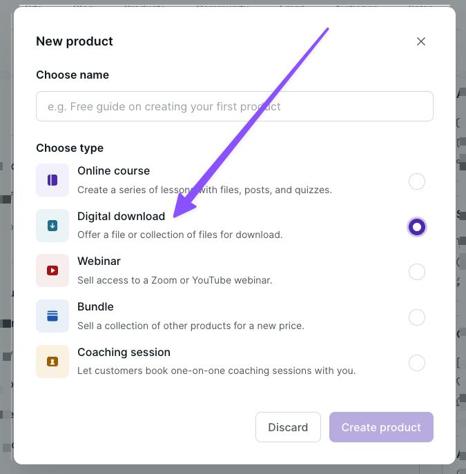
Once you’ve done that, click on Products in the navigation bar of your Podia account and choose ‘New Product’:

A popup will appear. Here you can enter a name for your lead magnet (you can change it later.)
Be sure to select ‘Digital Download’ as the product type as this has a ‘Free Email Delivery’ option later on (bear with us!)
In the digital download editor, you can add files to your digital download product. You can upload as many files as you like. If you upload multiple files, these will be automatically zipped by Podia's system once they're downloaded by your customers.

Once your files are uploaded, you need to select Pricing and then choose ‘Free Email Delivery’:
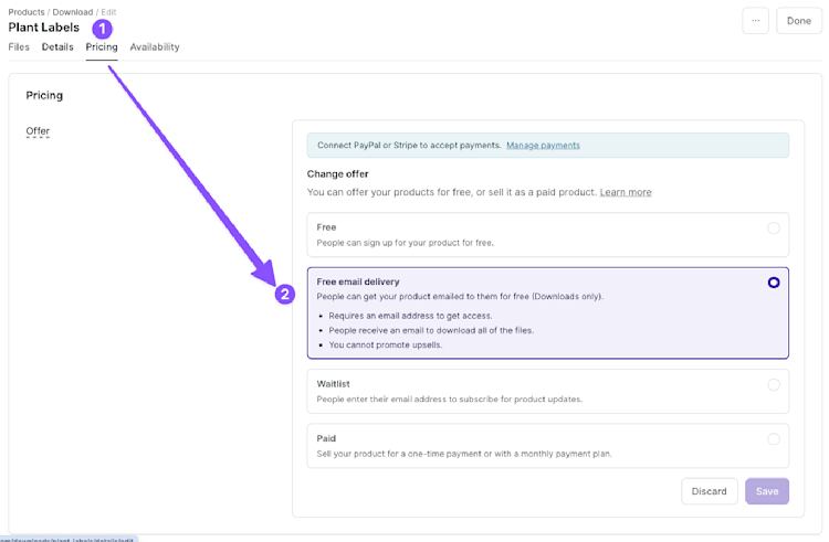
This will ensure customers need to enter their emails to sign up for your lead magnet without needing to create an account.
When you’re ready, hit publish on your product.
Designing your lead magnet landing page
Now that you’ve got a lead magnet and a way to deliver it (we’ll do all the work for you!), you’re going to need somewhere to direct people to where they can enter their email.
MORE GOOD NEWS!
With your account on Podia, you get a website and a really easy place to edit it and make it look exactly how you want it without needing to work with a designer or developer.
To quickly get to your lead magnet landing page and start designing, click the […] button and then select ‘Edit Sales Page’
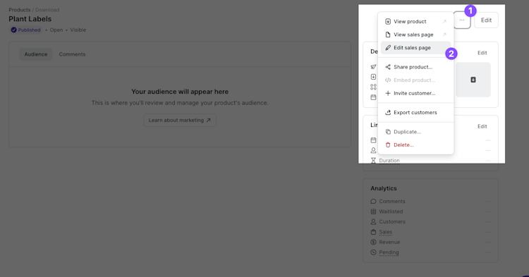
Editing your landing page on Podia is easy. This page took me just two minutes to build:
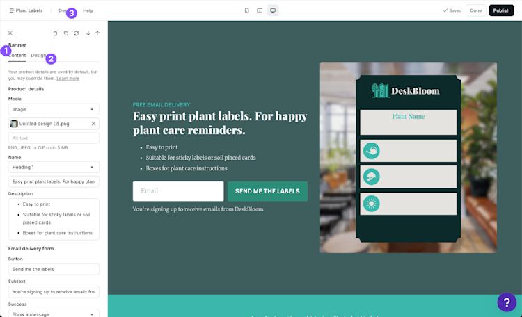
In the example above, I’ve added a few numbers to help you navigate easily:
-
On the content tab of each section, you can edit the text, add the images, and generally configure what you want visitors to see
-
On the design tab, you can choose from a number of different options including a series of predefined layouts, spacing, image styles and select a color palette (or create one that’s custom to this page)
-
If you don’t love the default design options (although they already look better than other website builder software) you can click the design tab marked by the number 3 on the image above which will allow you to set up fonts, colors, and more for your brand
You can also add additional sections by hovering over the designer and clicking the plus button that appears:

Before you finish designing, you’ll also want to set your page address. All Podia sites come with a free subdomain where you can access your website (e.g. [yoursite].podia.com) or you can connect a custom domain.
To grab the link to your current landing page, you can click the following things:
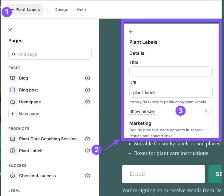
-
Click the menu in the top left corner of your website builder
-
Find the page you’re designing and click the cog symbol next to it (indicated by the number two on the image above)
-
The menu will reload to show you the settings of your current page. You can either copy the URL and start sending your audience to it to sign up or you can edit the URL if you want a different name for it (this is called a page slug – I know, gross)
Tip: some people like to hide the header on landing pages for their lead magnet. If that’s you, you can toggle the header on and off here too.
What do you do with this URL?
Step 2 – Add an email newsletter for your subscribers
The goal of setting up a lead magnet is to provide enough value to your audience for free that they’ll give you an email address.
In 2024, an email address is the most valuable thing an audience member can give you (besides, you know, cash – but we’ll get to that later). If you have an email address, you can use email marketing to continue to own the relationship with your subscribers so that you’re never at risk of losing out when a social network changes its algorithm.
But how do you stay in touch with your audience members? An email newsletter!
The beauty of an email newsletter is that it’s kind of like a membership except you can use it as a tool to sell much higher ticket items than a membership – and it’s available to everyone so you’ll never have to prioritize creating for a tiny segment of your audience.
With your Podia account, you can have 100 subscribers for free which is enough to start making some money in the next step.
Every person who downloads your lead magnet automatically gets added to your Podia account and you can send them email marketing.

There are two kinds of email you can send with Podia:
-
Broadcasts – one-off emails that are used for things like regular newsletter updates or time-limited offers
-
Campaigns – automated sequences of emails that you can trigger when a subscriber takes a specific action like buying a product or getting added to your audience for the first time
If you’re following along with this, we’d recommend you start by trying to send a regular newsletter where you share some of your expertise.
It’s extremely easy to build a beautiful looking email on Podia and it works in a similar way to the website builder.
Here’s an example that I made earlier:
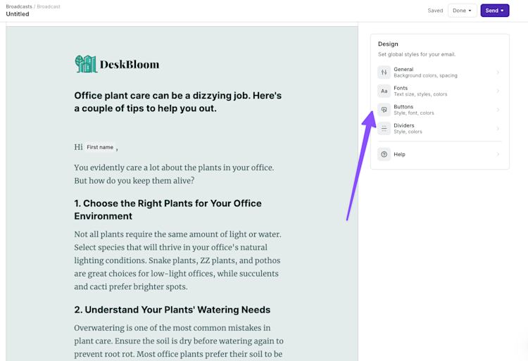
Tip: If you’re not feeling like designing your own, you can choose one of the many pre-made templates available in your Podia account and adjust it to your needs (or send it at is)
Here’s a few email topics that you could try out:
-
5 tips to help you get better at [your topic]
-
A story of how I [achieved the outcome your subscribers want]
-
Quick guide to [specific task your subscriber needs to do]
Don’t overthink it at this stage. The goal is simply to remain in contact with your audience so that at a later date (pretty soon hopefully) you can tell them about the paid product you just launched – which is where you start making the real money.
Set and forget: use a new subscriber campaign to quickly engage your audience
A campaign to welcome new subscribers – the people who downloaded your lead magnet – is a great way to engage them and give them a taste of what’s to come.
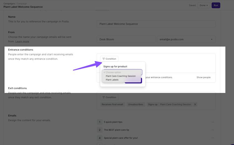
To do that, just hover over ‘Email’ in your navigation bar on Podia and select ‘Campaigns’. Then create a new campaign and set the entrance condition to ‘Signs up for Product’ and select the name of the Lead Magnet you made.
Then you can add a series of emails that send over time to welcome your new signups. Here’s the lead magnet welcome sequence I have set up for my personal side-project:
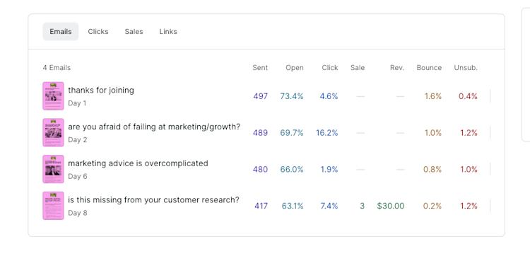
On day 1, I welcome them to my newsletter and tell them a bit of my story. On day 2, I dive a lot deeper into the topic I talk about. Day 6 is where I present them with a world view that I hold, that they might find surprising. Day 8 is where I offer them a product and start making money.
And on that note, let’s move on to the key piece of this whole framework: MAKING MONEY!
Step 3 – Launch a paid product
So far, we’ve created a lead magnet to help us convert strangers to subscribers and an email newsletter to help us build trust – now we need a way to turn this into sufficient revenue that you don’t feel the need to build a membership which is going to drain all your energy and time from you.
How do we do that?
We launch a product that’s related to the problem solved by our lead magnet!
With your Podia account, you can launch your product (that’s been covered off by the lead magnet you set up) so you have two options:
-
You can either launch a coaching session
-
Or you can create another product (both Mover and Shaker plans include unlimited courses, downloads, and coaching sessions)
We’ll walk you through both here so you can make the choice for yourself:
Set up a coaching session
Once you have built trust with your audience, offering a coaching session can be a very effective way of converting the effort you’ve put into your content into sales.
For example, when I showed you the lead magnet I set up earlier, you’ll have noticed that it was for my fictional business DeskBloom which specializes in helping office managers create green environments in their offices.
My lead magnet was a downloadable of ‘Plant Care Labels’ which help them know when to water, what conditions the plants like and recall the names of each plant.
Then my email sequence was geared towards simple plant care tips that they could use to improve their offices.
For my coaching session, I’ll set up a simple coaching session where my subscribers can pay me for a 15-minute call where they use their camera phones to show me around their plants and I offer them advice.
Let’s dive in.
I start by creating a new product in the same way I did earlier except this time I’ll choose ‘Coaching Session’:
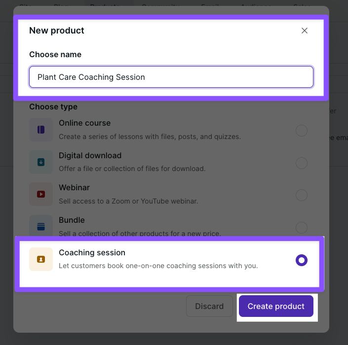
The setup of a coaching course is slightly different to other products because you actually paste a link from Calendly, SavvyCal, Acuity, or YouCanBookMe to embed a booking calendar on your customers’ product page.
Here’s how it looks with my calendar link in it:
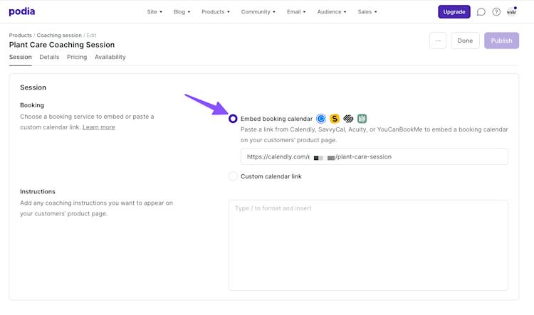
I can set my pricing and then publish. This is the moment where I can design the landing page but as we’ve already done that above and it’s the exact same process, I’ll skip it here.
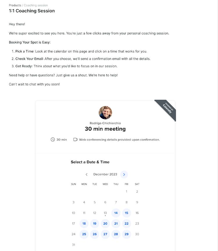
Once your subscribers have bought your product, they’ll be taken to the customer only area where they’ll see your calendar widget embedded. Here’s my colleague Rodrigo’s page as an example:
Set up another downloadable or course
If 1:1 facetime isn’t your thing or you just don’t want to do coaching sessions, there are many other kinds of products you could sell as your first paid offer.
The most successful people tend to start out with a downloadable that builds on the thing that their lead magnet helped their subscribers get done.
Some good examples of downloadables:
-
Template packs
-
Planner documents
-
Project plans
-
Technical files
-
Short ebooks
Any of these could work for you and you’re not limited to them either.
Setting up a course is another option but remember that this takes time and a lot of people get hung up on getting the content perfect.
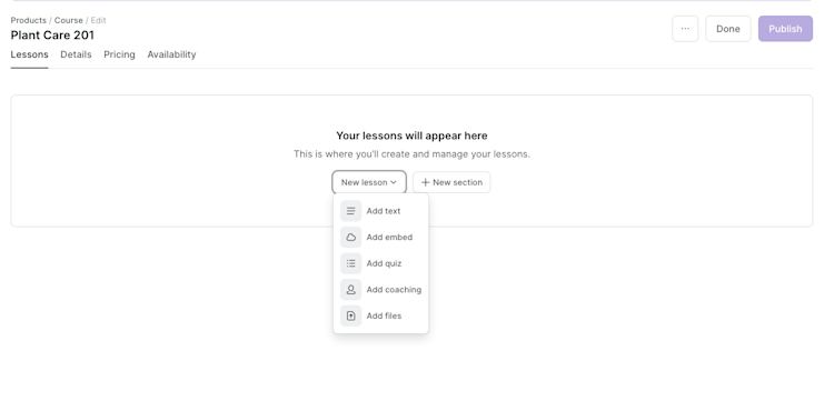
Creating a course is easy in Podia. You just choose ‘Online Course’ from the new product menu in the same way we’ve outlined above.
From there you can set up your course by adding Sections (like modules) and Lessons which could be text, embeds, quizzes, coaching sessions, or files.
Tip: With Podia you can also offer upsells of additional products at your checkout. This is a great way to increase your revenue with no extra effort.
Step 4 – Add blog content to your website
We’re really rolling now. So far you’ve got:
-
A lead magnet – A way to encourage your audience to give you their email address
-
An email newsletter and automated welcome campaign – to build trust with your subscribers
-
A paid product – that you can use to turn that trust into cash
But what’s missing? A way to get more and more people to discover you without you needing to create content all the time.
The simplest of all marketing strategies is to create a few pieces of content that help people who are looking for solutions to specific problems that you could solve for them with the things in steps 1,2, and 3 of this process.
With your Podia site, you also get a free SEO-optimized blog that looks great out of the box, and you can manage without fussing with plugins or themes.
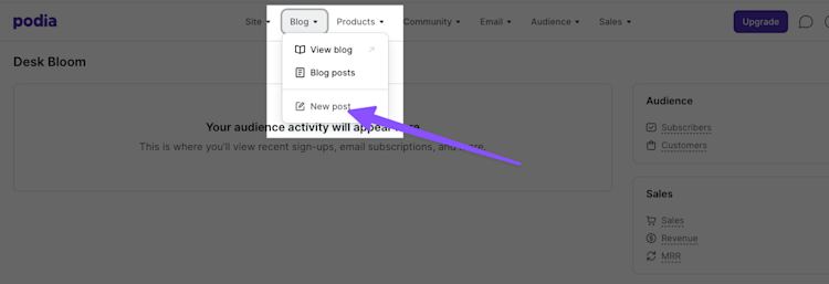
To get started with setting up your blog, simply click ‘Blog’ in the navigation of your Podia account and then choose ‘New Post’ from the drop-down menu:
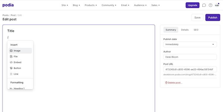
You’ll notice how simple the New Post page looks when it loads. You can write your content in the big box on the left hand side.
To add an image, file, embed, button, line or to manage the text formatting options, you can just type ‘/’ on a new line and you’ll be offered a menu of those choices:
If you already have content written in a document or anywhere on the internet, you can copy and paste it directly into this space. Podia will match your text formatting and import images as best it can but you may have to make some adjustments depending on what you’re copy pasting.
The goal here is not to always have another place to create content – remember that’s what we’re trying to get away from by avoiding creating an online membership site.
Instead, we want to keep our content focused at this stage so that it does the most work for us.
How do we do that? By writing posts about the most common problems your ideal customers have that you can solve with your content (and ideally your paid products!)
Here are some thought starters that we have found to be particularly helpful:
-
How to {subject} – how to guides are a time tested classic for helping people find you in search and solve their problems. Be helpful (like this post, hopefully!) and people will realize they could use your products to solve their problem (BTW – hopefully you’ve taken this as a prompt to sign up for your free 30-day trial with Podia. Meta. We know.)
-
Expert guides – this kind of content works really well when a person doesn’t have a specific problem to solve but they’re thinking about undertaking a process. In my example, maybe I could create an ‘expert guide to designing office plant installations’
-
5 top tips for {subject} – a mix of the how to content and expert guide content. Providing actionable lists of hard-earned advice frames you as the person who could solve your audience’s problems
A lot of guides tell you that you should create large posts – and, look, this one’s currently about 4K words long – but it’s not always necessary. We’ve seen people do really well with how-to articles that are under 500 words. We’ve also seen our own content sometimes get a lot of sign ups when we go deep and long on a subject.
After you’re done writing the content and you’ve got some posts published, you can design your blog page in the Podia website builder.
There are two things to design:
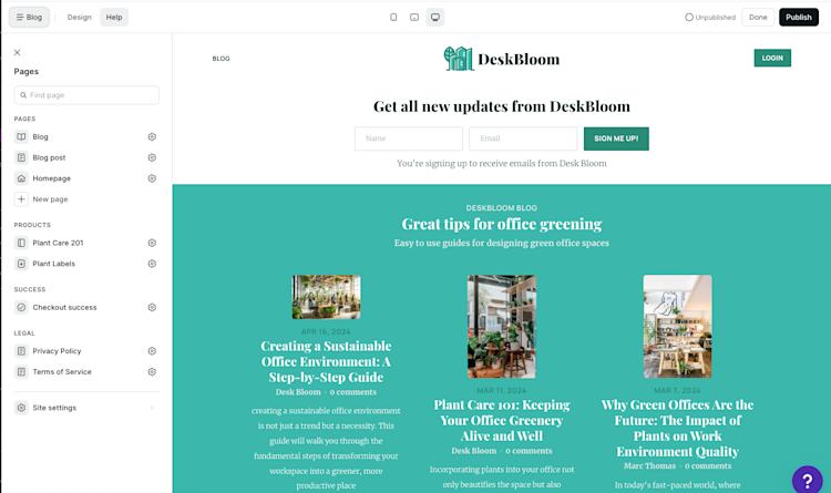
The blog archive page – this is where you’ll see all of your blog posts in a list. Here’s how mine looks after two minutes of adjusting design options like the layout and image size:
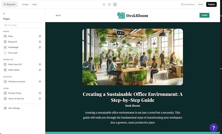
And also the individual blog post page template which is the template used by all your blog posts. It contains an example of the content from one of your blog posts to give you an idea of how all your posts will look when you publish:
To really make the most of this whole system, you should add an email signup form for your newsletter. You can do that by clicking on the + button anywhere on the page preview and selecting ‘Slim Email Form’ or ‘Email Form’ as the new section:
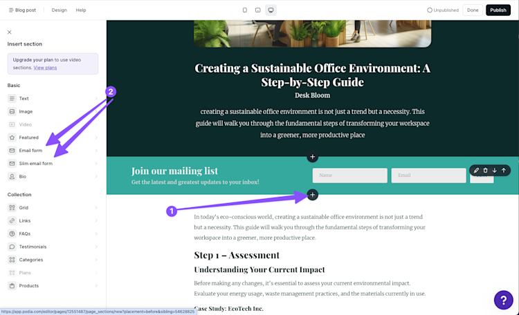
This form will add anyone who signs up by finding your blog to your Podia Email newsletter.
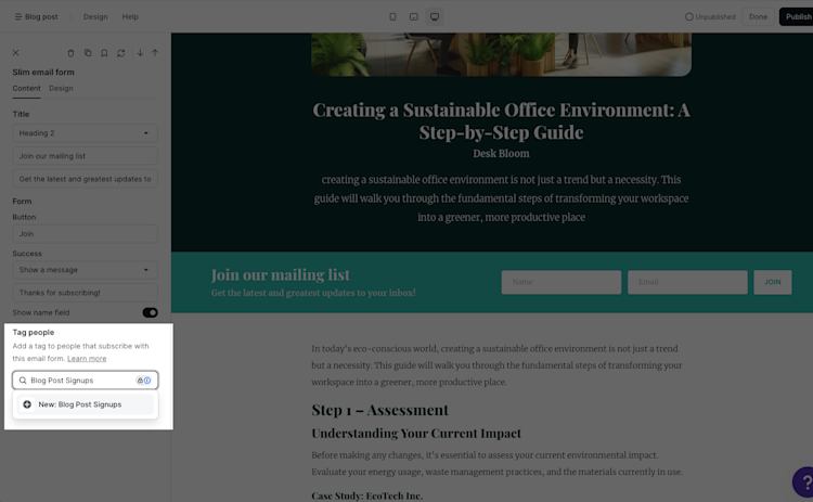
You could think about creating a new campaign to welcome your blog post subscribers and then add a tag to them automatically by adjusting your form’s settings:
This would give you a way to trigger the automated campaign directly from your Podia account as ‘Tag added’ is one of the entrance conditions available in Podia Email:
Step 5 – Start the process again to level up your revenue
That’s the whole framework. And while it might feel like a lot of work to get set up, we promise it’s a better long-term win than having to create content on a treadmill just to improve retention and stop your membership subscribers from canceling.
The cool thing about this system is that it gets better and better every time you run it.
Let’s say you’ve done one iteration of the flywheel and you made a good amount of money from your subscribers.
If you add an additional free resource that triggers a nurture campaign and a CTA to buy a new paid product, you can earn additional revenue from the same people.
A lot of people price memberships at a low price like $9/mo, but if you sold a low-priced product like a $100 download to your subscribers once every 6 months, you’d actually end up with $92 extra a year.
That’s before you factor in that many people add more and more premium offers to this kind of business. By not needing to focus on creating exclusive content for your membership, you can focus on driving more and more people to signup for your free offering… which means… more people for your paid offering!
Incremental revenue!
Don’t build an online membership — build a business flywheel instead
The dream sold by online membership tools is very attractive: you do what you love and you get money while you sleep.
But the reality is a lot different for the majority of people because it’s hard to get subscribers to give you their credit card details. Then you have to keep delivering on your value proposition and providing value with exclusive membership content.
Even if you do a perfect job of that, you’ll barely have time to acquire new subscribers which means that all that passive income is really just a pipe dream.
But there’s an easier way.
By building a flywheel in your business that acquires new subscribers, provides value for them on autopilot, and then monetizes them with one-time products and services, you can actually get paid for your expertise and still have time to grow your business.
You won’t ever have to worry about making sure your subscribers don’t churn or chasing up expired credit cards.
On our plans, you can:
-
Build a beautiful website complete with a blog
-
Offer a lead magnet that gets delivered automatically
-
Set up email marketing that helps you drive more sales
-
Set up additional paid digital products
It won’t be easy, but it is simple, and you can do it all on Podia. Try it for yourself with a free 30-day trial today.


